When I work with clients, I root their brand in a single season.
Why you might ask?
Because each season carries its own psychology.
For example, when you think about Summer, what do you think of? Maybe ease? Maybe slowing down? Maybe a bit romantic and natural?
Now, let’s switch to winter. What do you associate with winter? Strength? Quick thinking? Beautiful, but harsh?
In both examples, you can instantly feel a certain emotion associated with the season (even if you don’t expect it). Fiona Humberstone from The Brand Stylist first introduced me to this concept in 2021, and ever since, I’ve been incorporating it into each brand I help build.
Spring is all about freshness, optimism, and possibility. Strategically, a Spring brand feels approachable, lighthearted, and full of new ideas. This season moves fast, so Spring brands are often forward thinking and bursting at the seams with ideas.
Color palettes are light, bright, and soft to reflect the fun energy of the season. When building brands that are rooted in spring, you naturally are drawn to shapes and illustrative styles that are circular, simple, and even a little fun.
Because simplicity is the name of the game, you’ll find Spring brands using fonts that are clean and modern paired with those that are handwritten and expressive.
Summer carries ease, artistry, and authenticity. It’s the season of doing things well and absolutely by the book. Quality plays a major role in all Summer brands, so you will find many brands rooted here that value process and structure.
Summer brands are also cool, calm, and collected. You won’t find them rushing around. They are elegant, graceful, and naturally gentle. Color palettes for this season are more delicate, softening to exude the quiet confidence of the brand.
Serifs (the fonts with the little “feet”) are an absolute must in this season to showcase the traditional and dependable nature of the brand. Flowing script fonts that are almost carefree in nature pair nicely with the serif fonts. Messaging and copy for a Summer brand resonates with the romantic nature of the season.
Autumn is all about depth, richness, and storytelling. It's a season of transition, imbuing all brands rooted in it with a sense of productivity. Because this season runs at a pace, similarly to Spring, passion and energy drive Autumn brands. Most brands in this season challenge the status quo and defy what’s around them.
Color palettes for this season are warm, deep, and maybe even a little intense. Of all the seasons, Autumn has the largest range of colors, encompassing the substance and heart of the season. Fonts for the season aren’t always what they appear. You can find unique and imperfect fonts being utilized by Autumn brands as well as rustic and chunky ones.
Strategically, Autumn brands thrive on heritage, narrative, and leaving a legacy; so their messaging will lean into storytelling and authenticity.
Winter carries strength, clarity, and sophistication. Winter brands are decisive and dramatic, and are not likely to compromise. This is a season of extremes, so you’ll see brands that are luxurious and extravagant alongside those that are more budget friendly rooted in this season.
Winter color palettes are cool and striking - think jewel and neon tones. Because of the rigidity of this season, you’ll often find geometric shapes being utilized throughout the visuals for a Winter brand. Fonts are highly expressive and dramatic that ooze opulence.
There is nothing in moderation for this season. From bold, editorial photoshoots to high contrast graphic elements, the Winter brand is all about making a statement.
As I’ve mentioned, the colors, imagery, textures, and even the shapes you choose all carry that seasonal psychology forward.
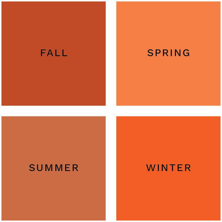
Let’s take the color orange for example. Out of the four oranges below, can you guess which color is for which season?
And don’t cheat by scrolling down.

Did you guess them right?

Color is often the most immediate way we feel the shift in energy. A single shade can take on entirely different meanings depending on the season it’s rooted in. A soft orange, for example, can feel fresh and playful in Spring, sun-warmed and vibrant in Summer, rich and earthy in Autumn, or bold and striking in Winter.
It gives every visual choice, from color to texture to shape, a clear emotional anchor. Instead of scattering your brand’s energy, it channels it into a rhythm that people can instantly recognize and connect with.

Brand and Website Designer crafting strategic, elevated designs for mission-driven entrepreneurs, small businesses, and nonprofits.
And I'm here to help every decision, design, and message work towards the building the business and brand that you’ve imagined.
tell me more

