

I first worked with Danielle and her daughter, Katie, when they first launched their permanent jewelry business, Infinite by Katie. Together, we built a brand that reflected the heart-work they bring to every client session and gave them a foundation to grow into markets and events.
Since then, the business has grown into something new.
They were moving locations, consolidating their services, refining their focus, and ready to elevate their visual identity to match, all under a new name: Katie & Co. They needed a website that could bring together their permanent jewelry services, the studio itself, the new workshops they’re launching, and the story of how they got here.



During the strategy process, we shifted the messaging away from the “infinite connections” of the previous site. The new messaging focuses on the emotions they want people to feel when they interact with the brand: the moments experienced and the memories made.
For the visual direction, we wanted a logo suite that would be easy to use and scale while still paying homage to iconic jewelry houses like Tiffany & Co. We moved the colors and fonts away from a middle-ground feel toward something more luxurious, without losing the pink, the vibrancy of their photos, or the essence of where they started.
The primary logo builds on the previous version and uses a font from the same type foundry. “and Co.” stays with “Katie” for legibility and to honor the team that helps bring Katie & Co. to life. Subtle edits, especially the “K” and “A” joined at the base, show Katie and company working together to bring jewelry to their community. Like other luxury labels, the logo has no color. That keeps it legible across every colorway and gives it a modern, elegant feel.
The brand symbol pairs the rigid structure of the expertise they bring to their work with the flowing, warm, and fun “&.” Together, they create a mark that represents their whole mission. The two pieces connect and intersect like the links in the permanent jewelry that got them where they are today.
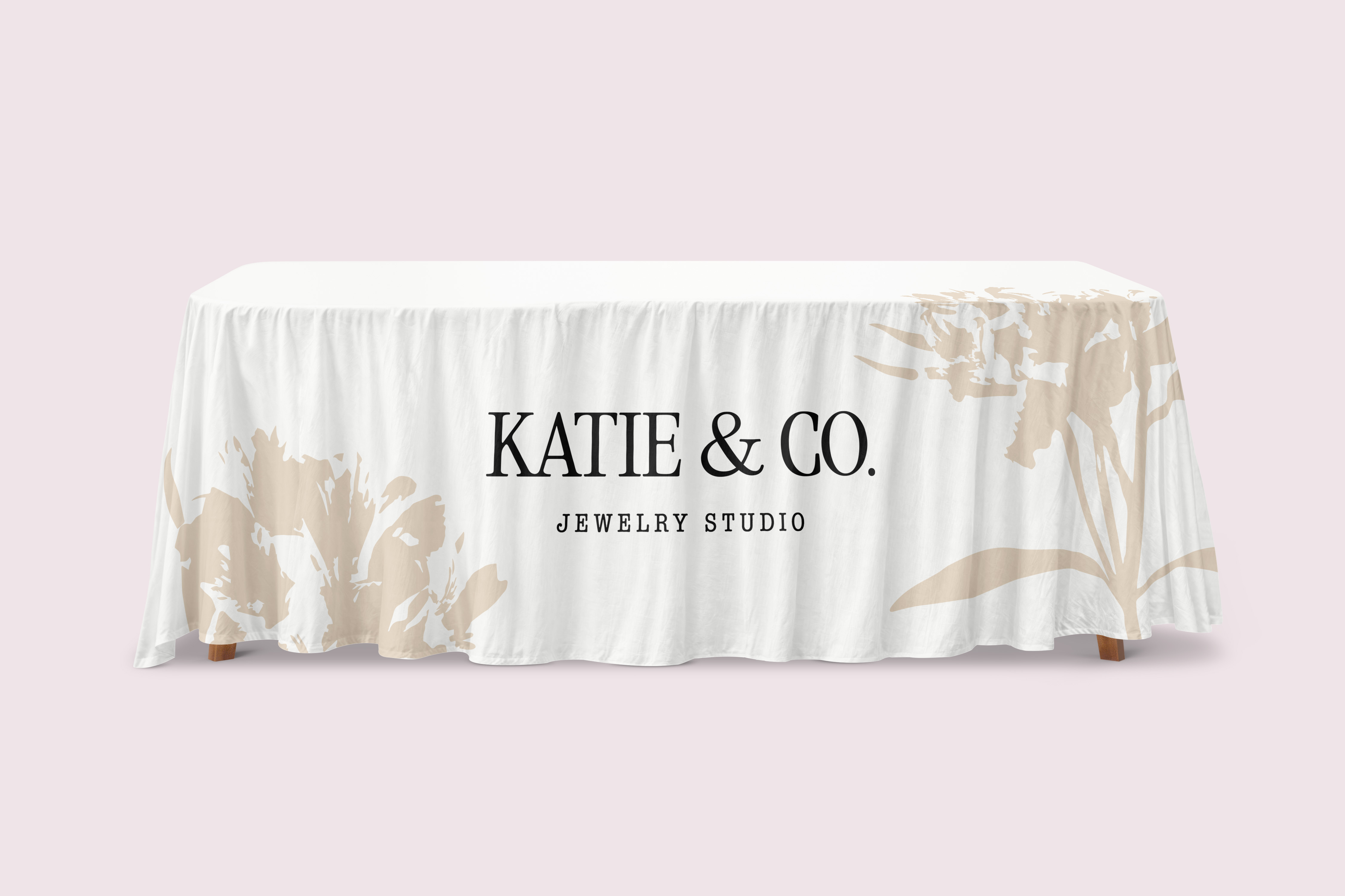


We carried the Alstroemeria flowers* over from the original brand but moved them into the background as accents instead of focal points. Chains join them as accents, including as section dividers throughout the website.
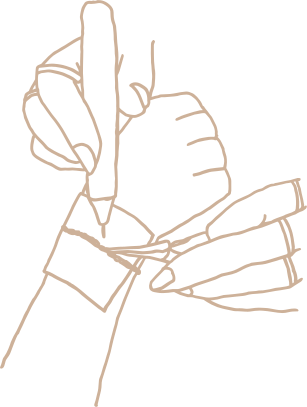
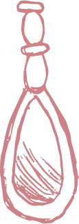
To add a personal touch, I created handmade elements: hand-drawn illustrations of different parts of their business and a handwritten icon that looks like their own signature. These details let the brand feel elevated while keeping the warmth and playfulness that has always been part of who they are.
*These flowers are variations of the Alstroemeria (Peruvian Lily), which symbolizes friendship, joy, mutual support, and the ability to help each other through the trials and tribulations of life.

Katie & Co. went from a single landing page to a multi-page website with a home for everything they offer.
Their permanent jewelry services, the studio, and their workshops each have their own place, along with a calendar of upcoming events, pop-ups, and studio gatherings.
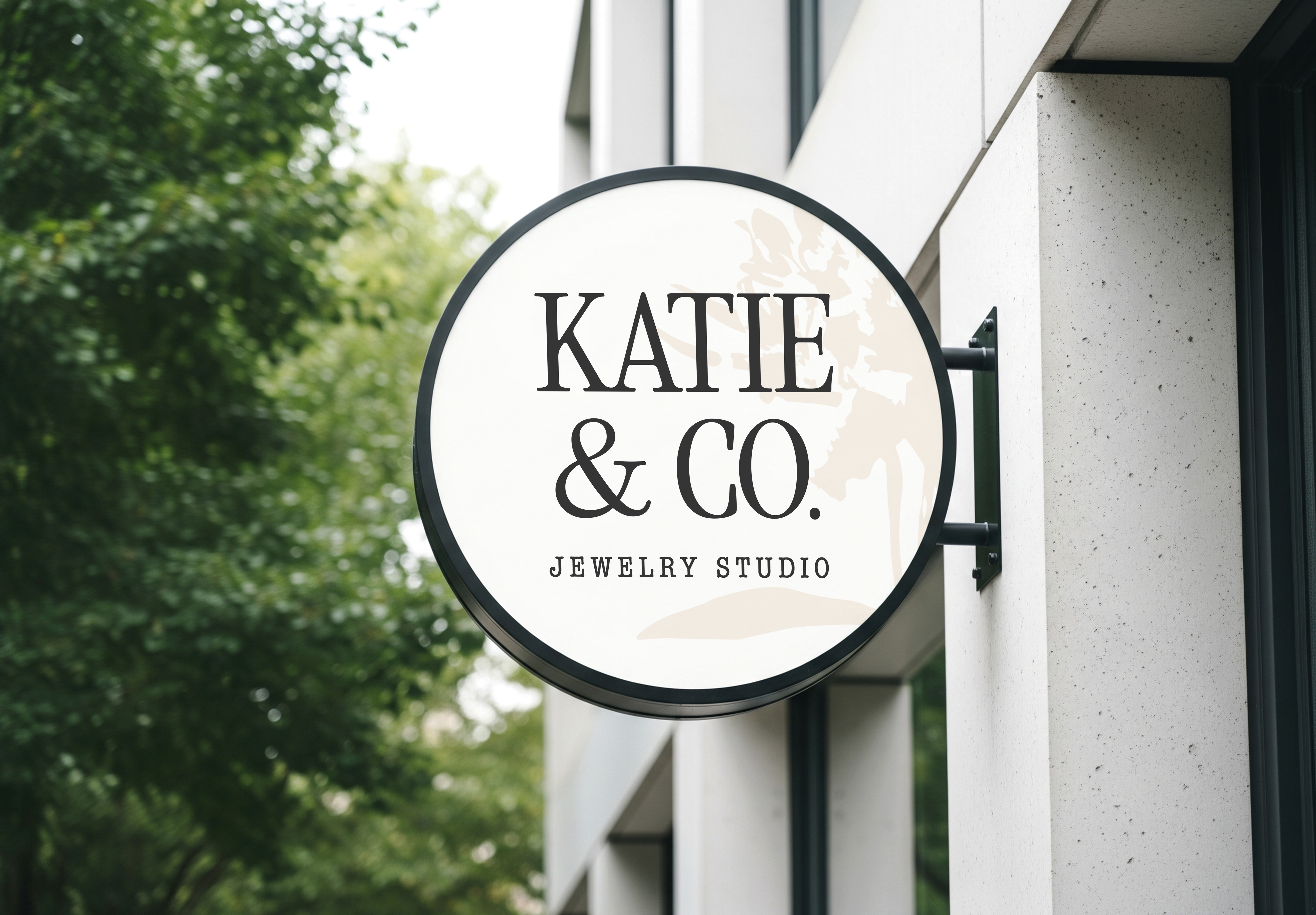
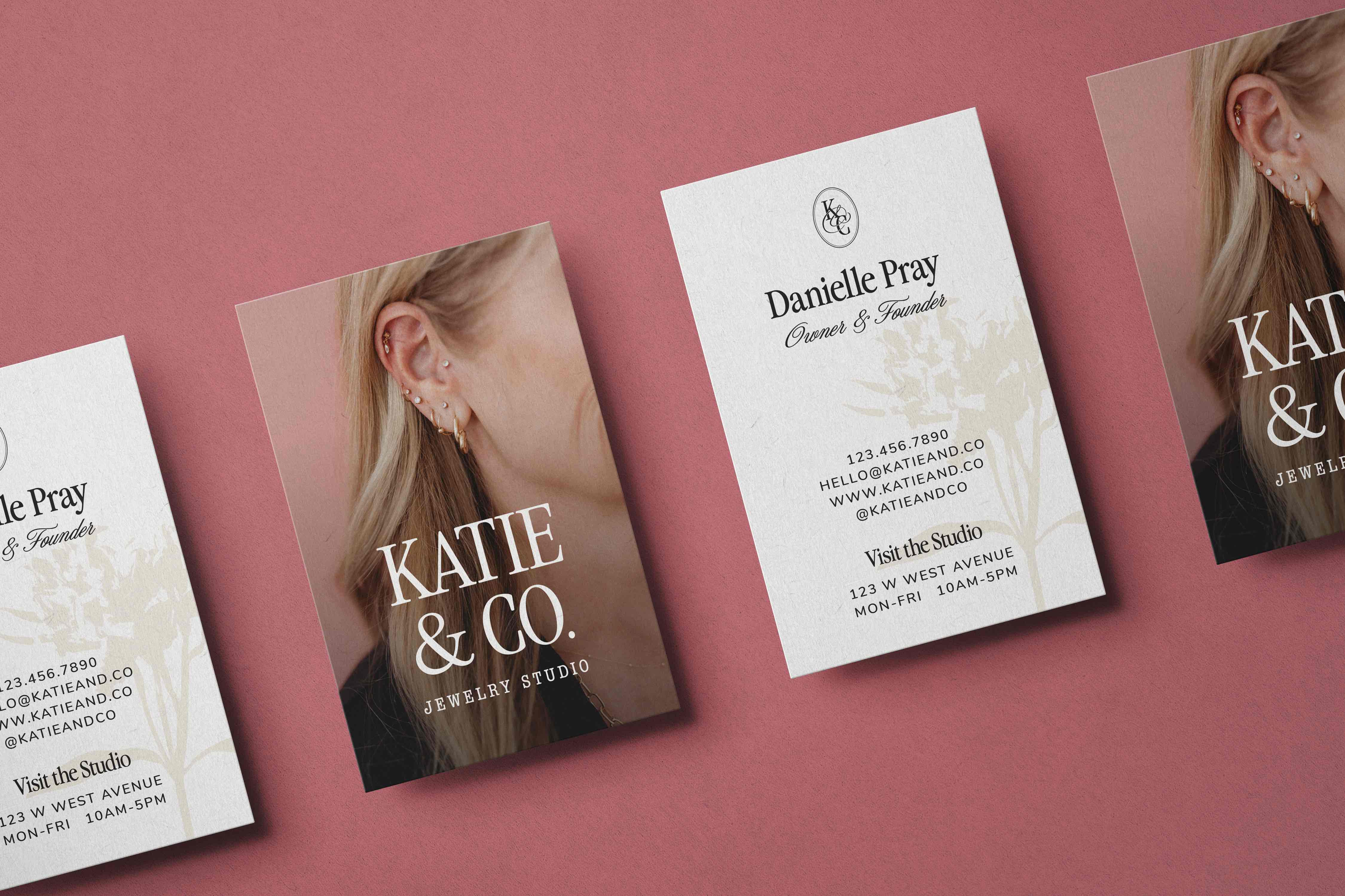
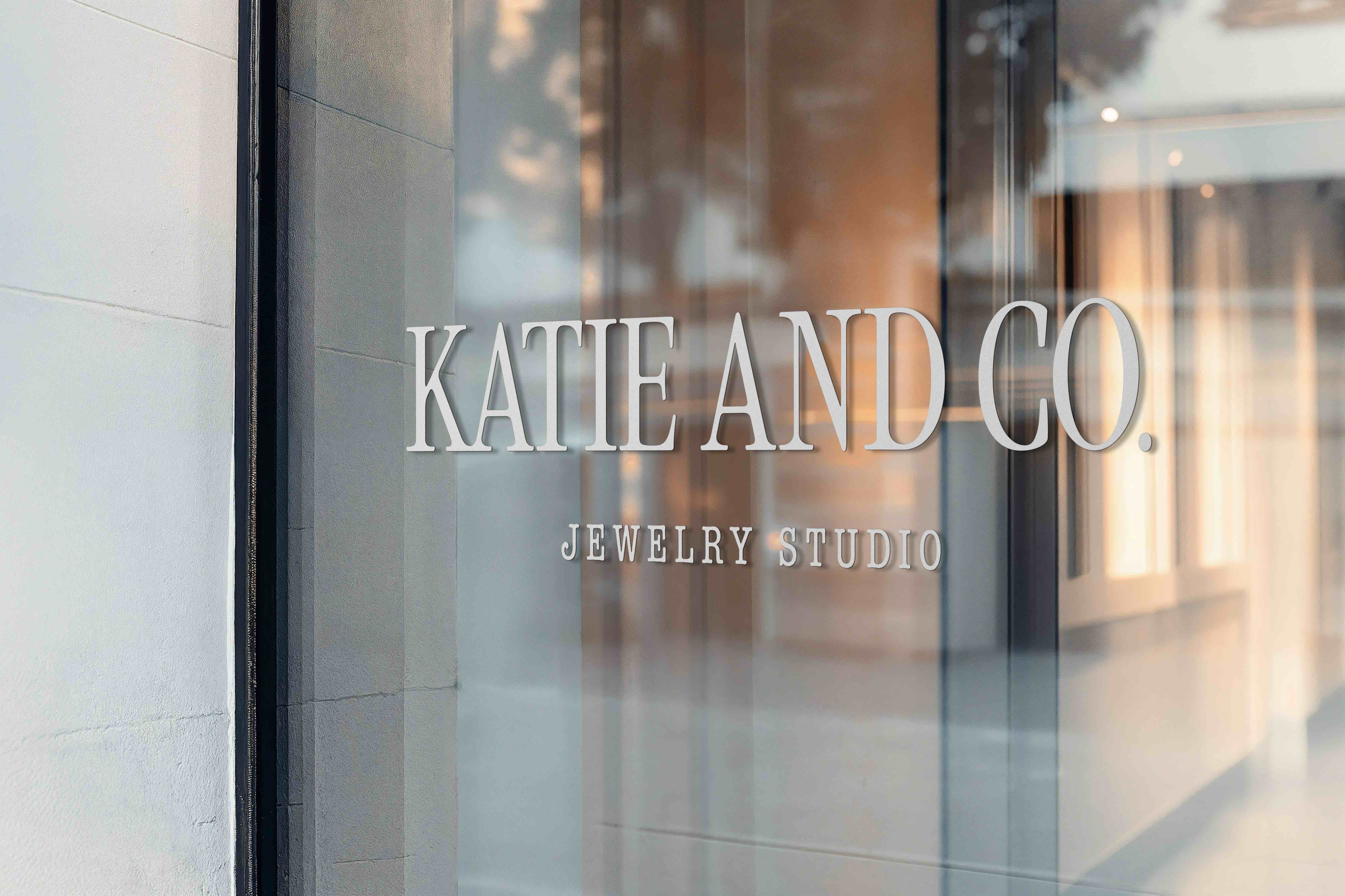
The refreshed identity also gave them new signage for the studio and a full set of options to keep their visuals consistent everywhere they show up. After launch, people were already reaching out to book their services.