back to all posts
Branding

5 Halloween Google Font Pairings

Fonts set the mood before anyone reads a single word. The same sentence can feel elegant, eerie, cozy, or completely unhinged, depending on the typeface it’s set in. 

‍

To celebrate spooky season, here are five Halloween font pairings, each built around its own theme. Every font is free on Google Fonts, so you can download them, play with them, and borrow the vibe for your own Halloween graphics.

‍

‍

‍‍

How to Pair Fonts (Spooky or Not)

‍

Whether you’re designing a one-off Halloween graphic or building a brand that lives on the dark side all year, the same basic rules apply.

‍

  1. Give each font a job. Try to use one font that brings the personality in your headline, your name, or the moment you want people to notice. And use the other font for paragraphs and details. If both fonts are trying to be the star, neither one wins.
  2. Create contrast, not conflict. Strong pairings are different enough that the difference looks intentional: ornate with clean, rough with refined, serif with sans serif. Two fonts that are almost alike just look like a mistake.
  3. Match the mood. Your fonts can differ in shape, but they should agree in feeling. A gothic blackletter and a bubbly rounded font tell two different stories, so pick fonts that belong in the same world.
  4. Stick to two or three. More than that rarely adds anything but noise and confusion.

If you’re building a spooky brand year-round, like a tattoo studio, candle shop, or haunted attraction, this matters even more. Your display font is where your personality lives. Your body font is what keeps you readable on a website, a menu, or a product label.
‍

‍

‍

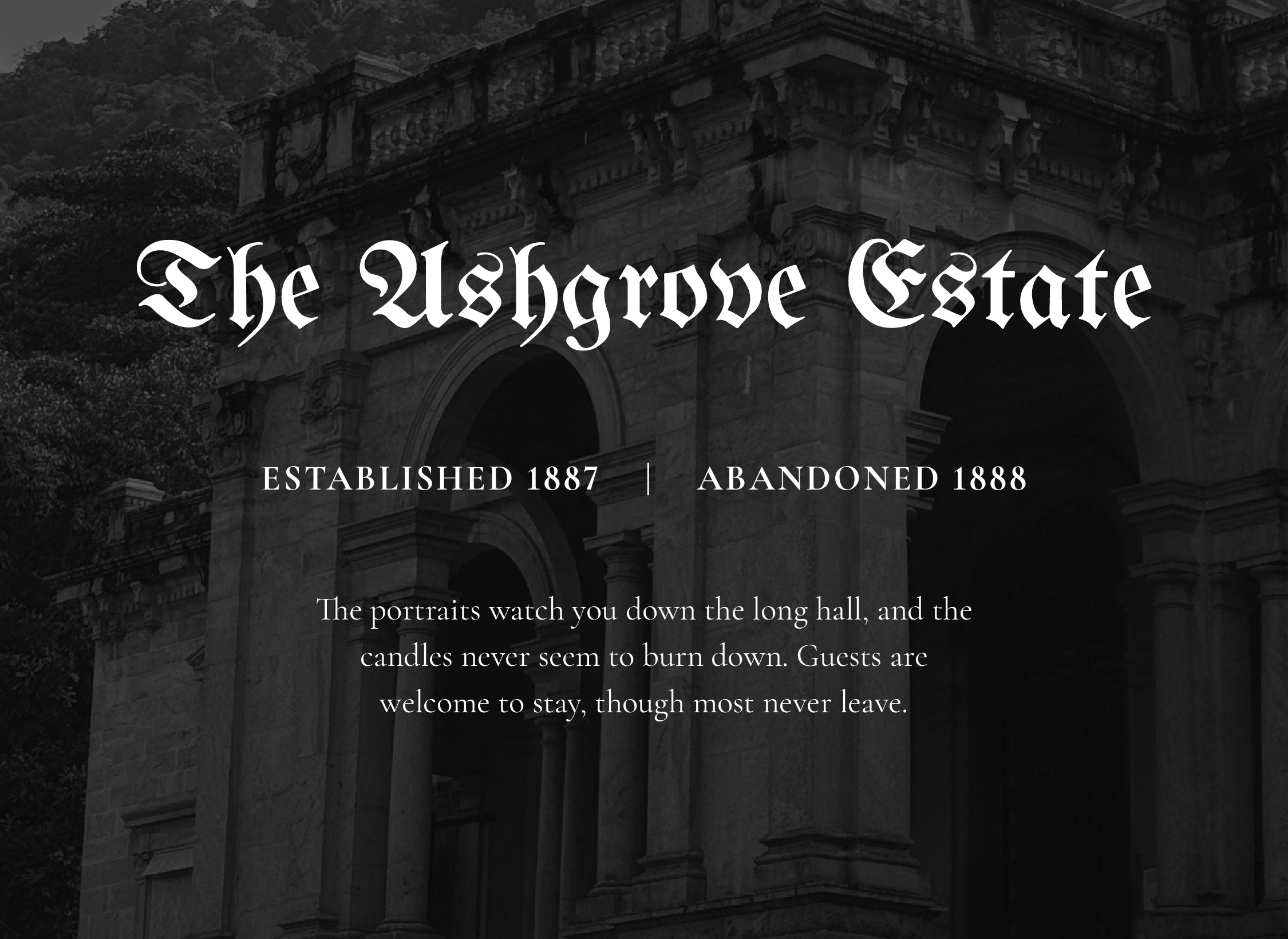
A stone mansion with white text overlaying it. The text reads "The Ashgrove Estate. Established 1887 | Abandoned 1888. The portraits watch you down the long hall, and the candles never seem to  burn down. Guests are welcome to stay, though most never leave." This is an example of two Google fonts paired together to create a spooky graphic inspired by a haunted Victorian manor.

‍

1. Haunted Victorian Manor

‍

Fonts: UnifrakturMaguntia + Cormorant Garamond

‍

Blackletter is dramatic and ornate, but it’s hard to read in long stretches. Cormorant Garamond has the same old-world elegance in a much more readable form, so it can carry the details while the blackletter gets the spotlight.

‍

Styling Tip: Use the blackletter for just one word or a short name. Pair it with black and white or deep plums, tarnished gold, and candlelit tones.
‍

‍

‍

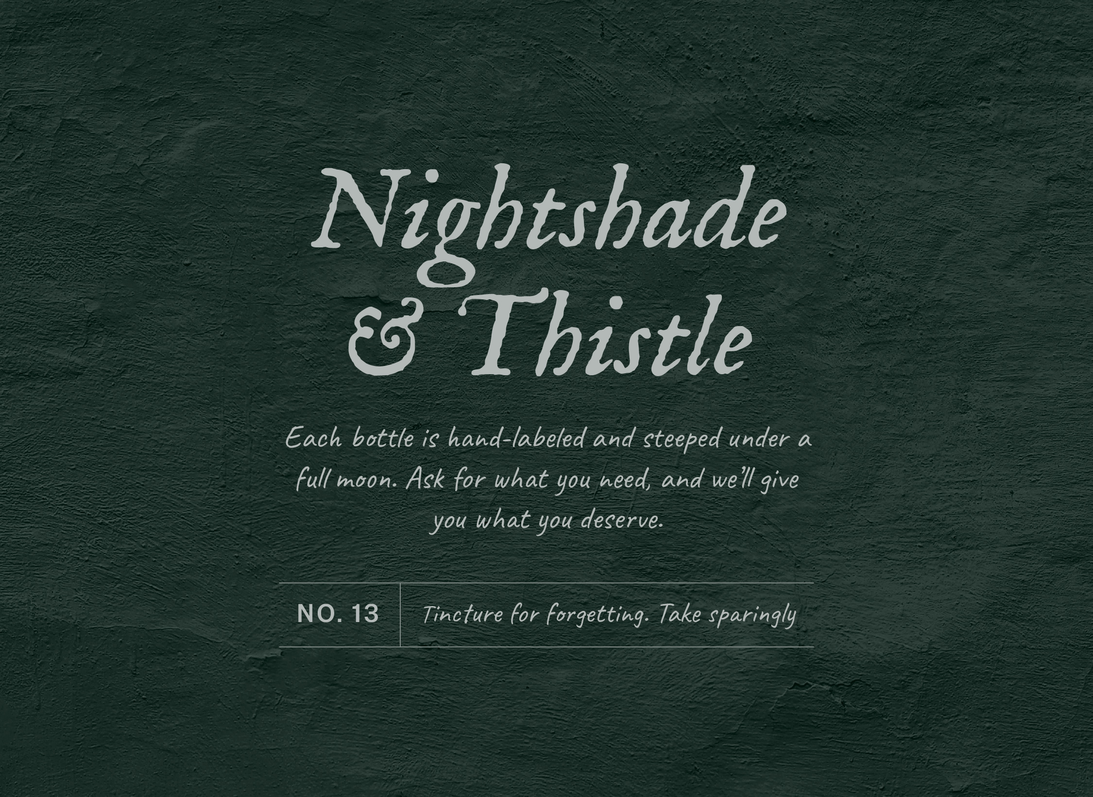
A green wall with white text overlaying it. The text reads, "Nightshade & Thistle. Each bottle is hand-labeled and steeped under a full moon. Ask for what you need, and we'll give you what you deserve. No. 13 Tincture for forgetting. Take sparingly." This is an example of two Google fonts paired together to create a spooky graphic inspired by a witch's apothecary.

‍

2. Witch’s Apothecary

‍

Fonts: IM Fell English + Caveat

‍

IM Fell English is based on centuries-old printed type, with slightly imperfect edges that feel aged and inky. The script font, Caveat, adds the human touch, like notes scribbled on a label by the witch herself.

‍

Styling tip: Make sure the leading (the space between lines of text) is large enough so the text is legible. Parchment, sage green, and inky black complete the look.
‍

‍

‍

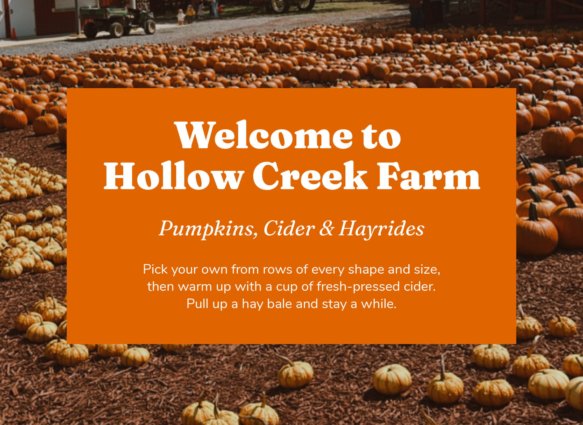
A pumpkin patch has a orange text box with white text overlaying it. The text reads, "Welcome to Hollow Creek Farm. Pumpkins, Cider & Hayrides. Pick your own from rows of every shape and size, then warm up with a cup of fresh-pressed cider. Pull up a hay bale and stay a while." This is an example of two Google fonts paired together to create a spooky graphic inspired by a pumpkin patch.

‍

3. Pumpkin Patch

‍

Fonts: Fraunces + Nunito

‍

Fraunces is a soft, slightly quirky serif with a warm, retro feel, especially when you turn up its “wonky” settings. Nunito’s rounded edges echo that friendliness and keep everything easy to read.

‍

Styling tip: Think hand-painted farm stand sign. Go for burnt orange, cream, and harvest brown.
‍

‍

‍

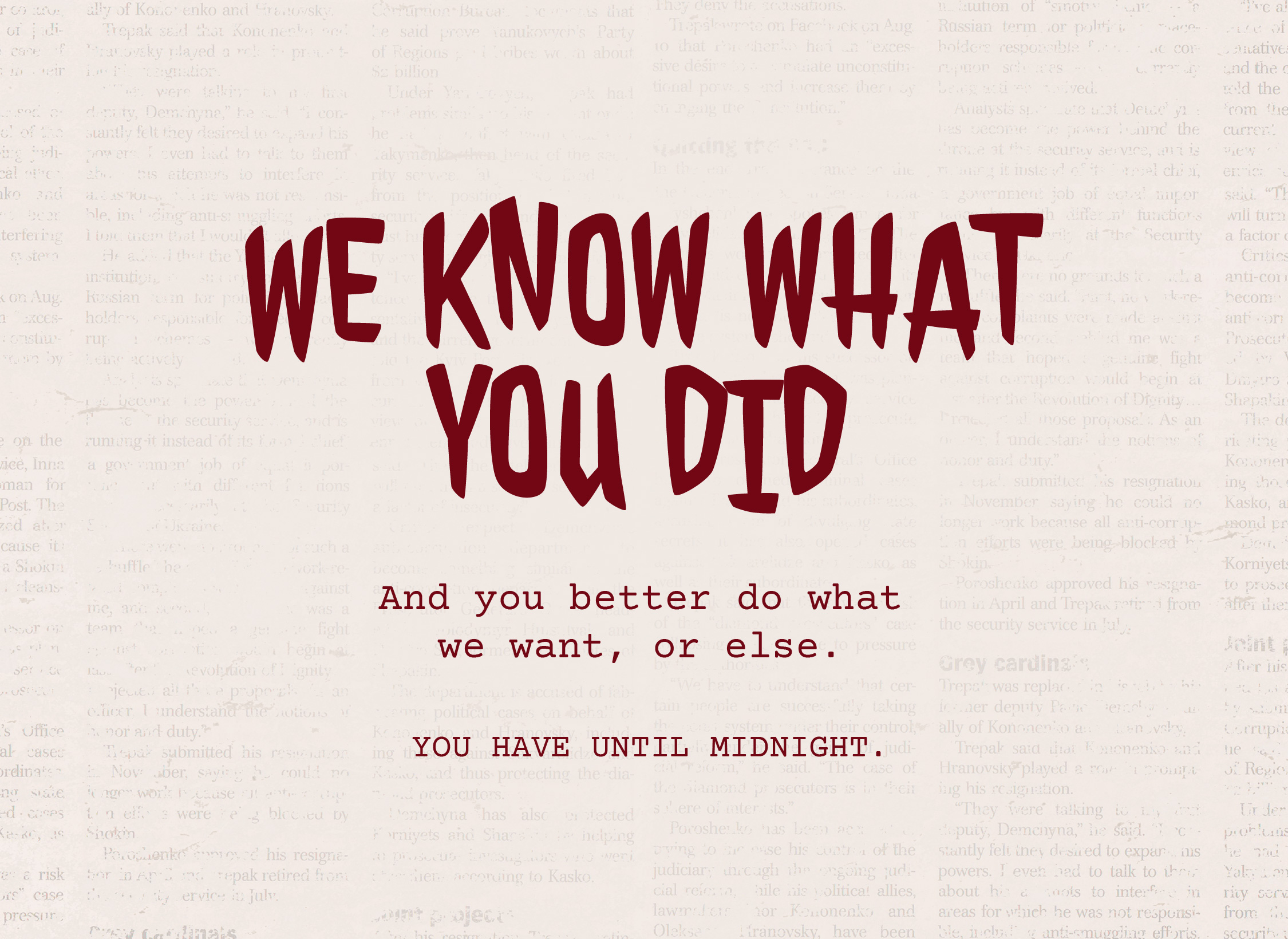
A faded newspaper has red text overlaying it. The text reads, "We know what you did. And you better do what we want, or else. You have until midnight." This is an example of two Google fonts paired together to create a spooky graphic inspired by a ransom note.

‍

4. Ransom Note

‍

Fonts: Jolly Lodger + Courier Prime

‍

Jolly Lodger feels unnatural, especially when you offset the letters, while Courier Prime’s typewriter look grounds it with an eerie, anonymous calm.

‍

Styling tip: Vary the sizes and shift the baseline of individual letters. Newsprint textures and high contrast make it feel truly unhinged.
‍

‍

‍

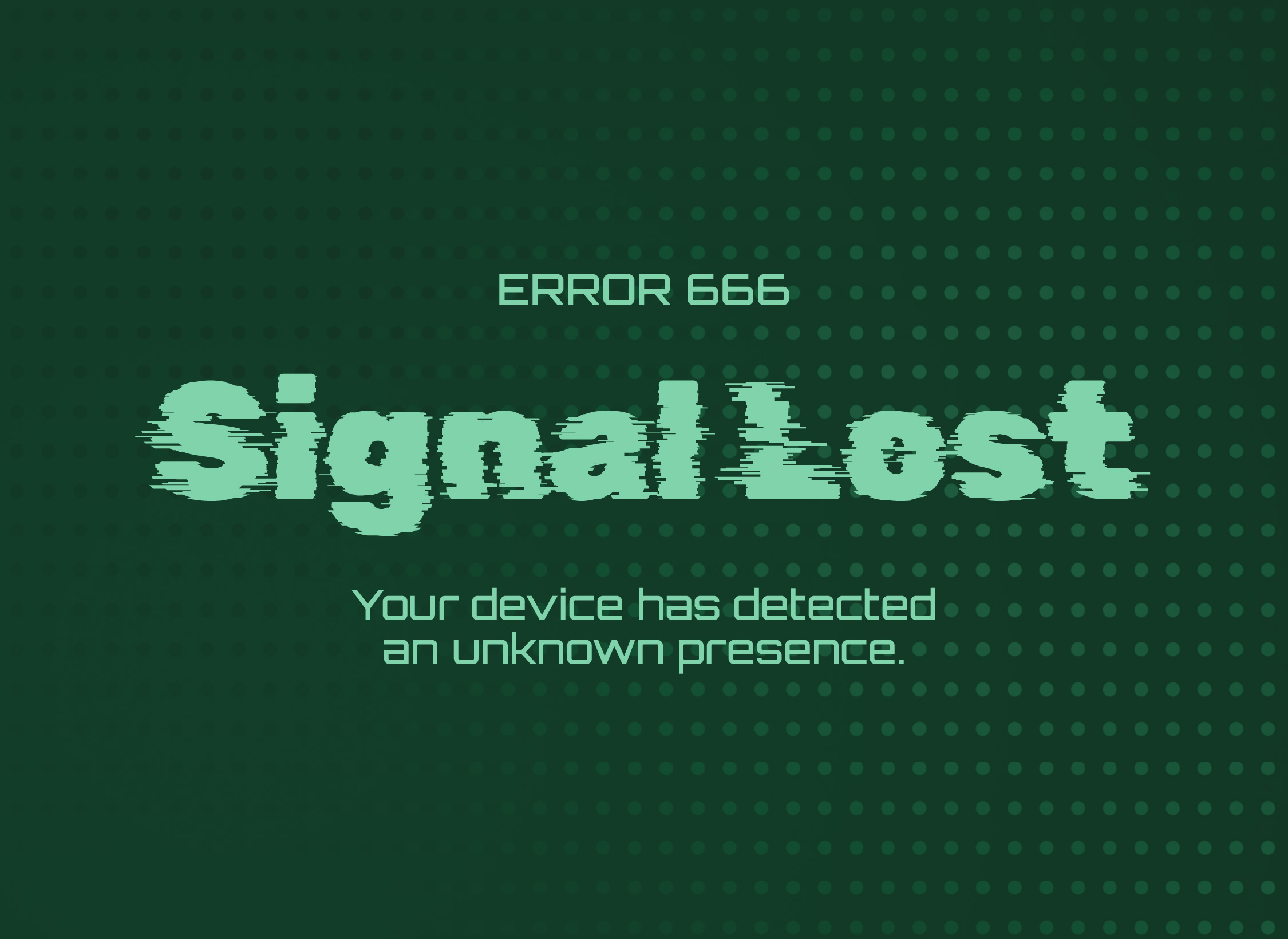
A green background with repeating dots has text overlaying it. The text reads, "Error 666. Signal Lost. Your device has detected an unknown presence." This is an example of two Google fonts paired together to create a spooky graphic inspired by possessed technology.

‍

5. Possessed Techology

‍

Fonts: Rubik Glitch + Orbitron

‍

Rubik Glitch looks like it’s breaking apart on the screen, and Orbitron reads like code or a system message. Together they make a haunting feel digital instead of old-fashioned.

‍

Styling tip: Use a dark screen, scan lines, and a slight RGB split on the headline. A cold green or icy-blue glow works well here.

‍

‍

‍

Every one of these pairings follows the same principle: one font brings the personality, and the other keeps things readable. 

‍

That balance matters just as much for your brand the other 364 days of the year. The right fonts tell people who you are before they read a word, and the wrong ones can send a message you never meant to send.

‍

‍

Love these pairings but would rather not wrestle with leading and baselines yourself? Let me design your Halloween graphics for you.
‍

‍Book a Brand Momentum Day

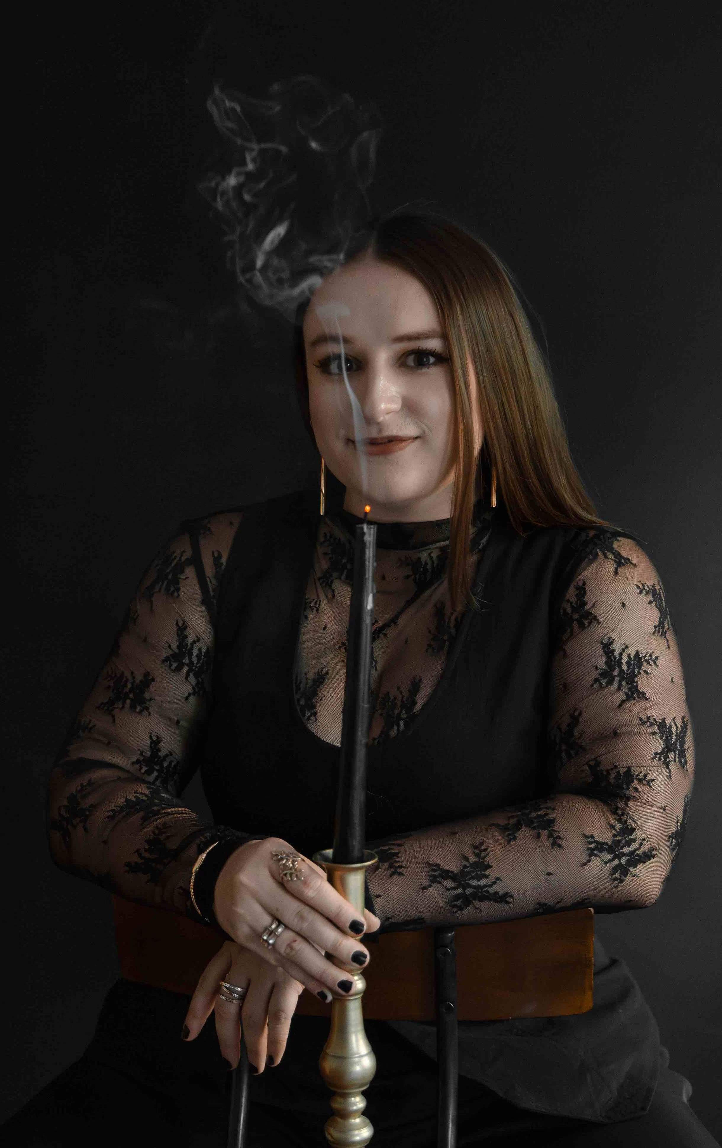
Woman in black lace top holding a smoking black candle in a brass candlestick against a dark background.
Hi, I'm Hannah

Brand and Website Designer crafting strategic, elevated designs for visionary founders and their business.

explore services

like this post? You’ll also love

A laptop balanced precariously on top of someone's feet. They are wearing a pair of black Doc Martens boots.

Hi friend, i'm

Hannah Hernandez

Brand Strategist, Website Designer, and Your Guide Through Your Next Transformation

And I'm here to help every decision, design, and message work towards the building the business and brand that you’ve imagined.

tell me more
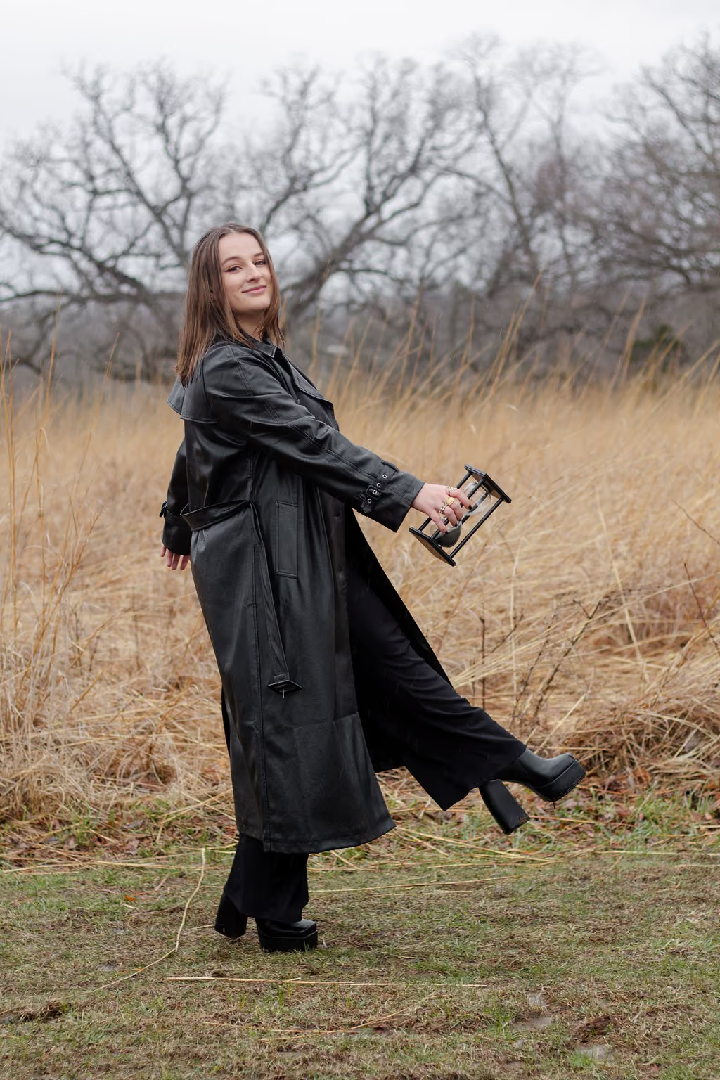
Hannah Hernandez, owner of EQBM Design Company and brand strategist and website designer
An illustration of a crow opening its wings.

Let’s transform your business with

Hannah Hernandez, owner of EQBM Design Company, typing on her computer and editing the copy on a website page.
01
Custom Branding + Website
02
Graphic Design Days
03
Workshops + Consultations
explore services
STALK THE SOCIALS @EQBMDESIGNCO
An illustration of a crow opening its wings.