When Danielle reached out to me, she and her daughter, Katie, were already running a successful permanent jewelry business. Her problem was that she wanted a visual identity that matched all of the deep, heart-work the two bring to every client session. One they could feel confident to stand behind and root their business journey for the next steps, which included participating in more markets and events.


The Infinite by Katie brand is inspired by the values of togetherness and empowerment. Each element is meant to exude warmth and elegance while still feeling playful. Subtle elements of the physical services of the brand were included in the logo suite, including a simple chain in the brand seal and around the "i" in the primary logo. The infinity symbol found incorporated in the "n" and the "i" represents the permanency of the actual jewelry and the hope that their relationship with each client will be, well forever.
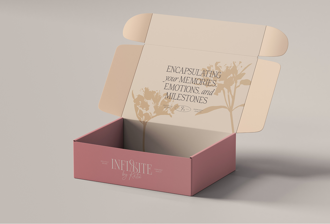


For Infinite by Katie, we wanted to incorporate subtle refined details, which included taking real flowers and creating playful shadows that could be used as background accents. These flowers are variations of the Alstroemeria (Peruvian Lily), which symbolizes friendship, joy, mutual support, and the ability to help each other through the trials and tribulations of life.


Infinite by Katie now has a brand and digital presence they can use to help promote their business, allowing her to start gaining traction on Google and having a place to direct potential customers to.