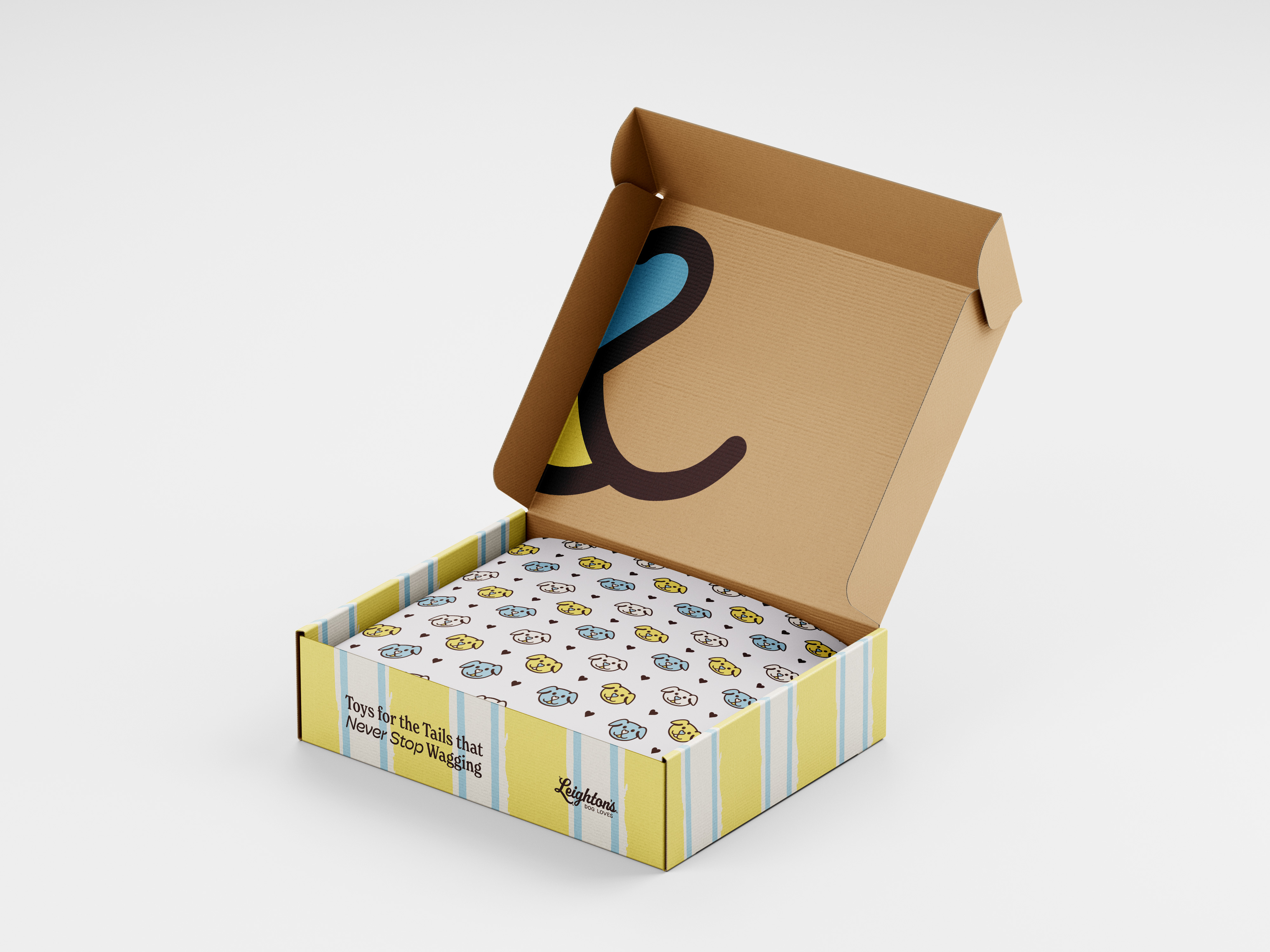
Alexis needed help bringing his niece's vision to life for a dog toy business. It needed to be fun and playful, but still well put together. They also wanted to incorporate a hand drawing of a dog that his niece had created.
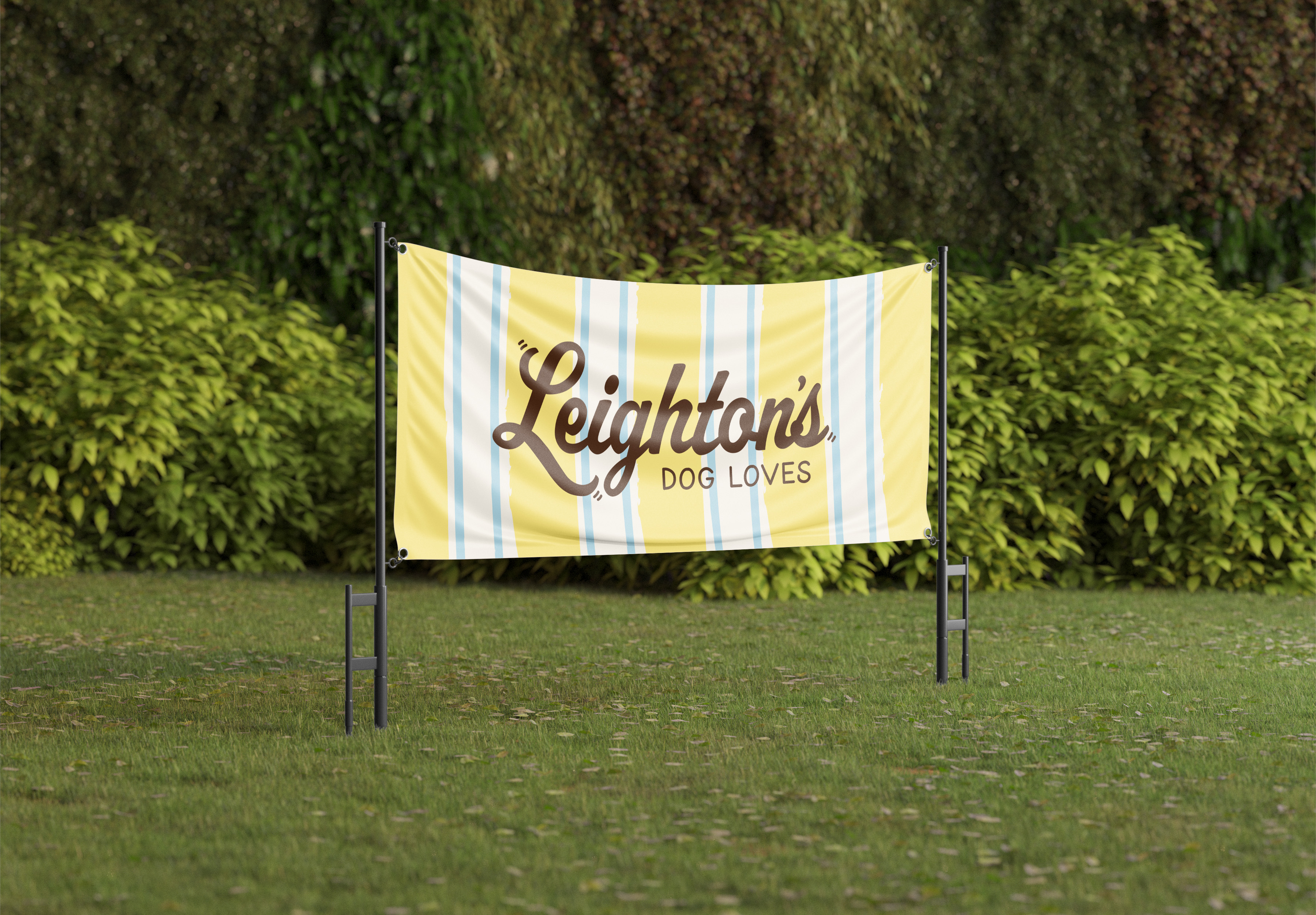
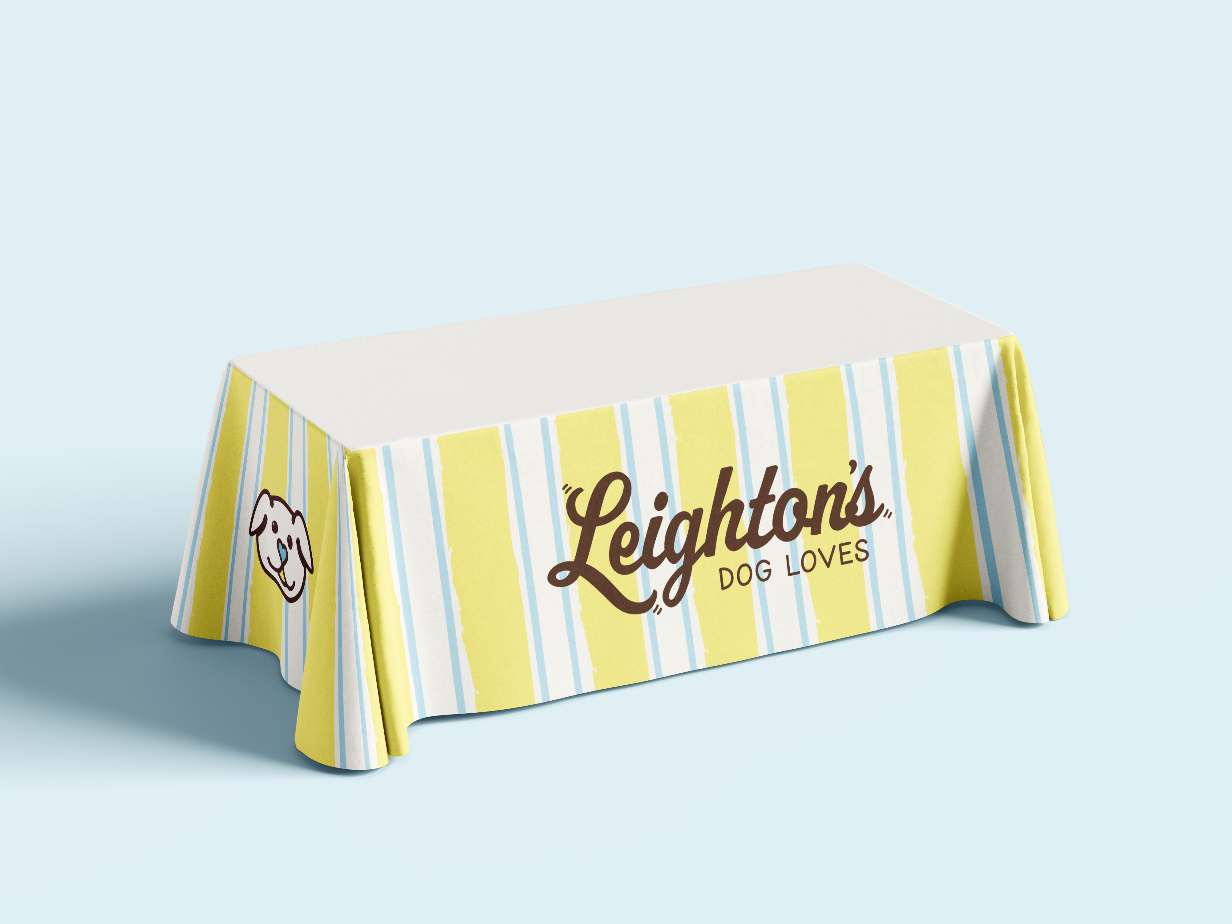
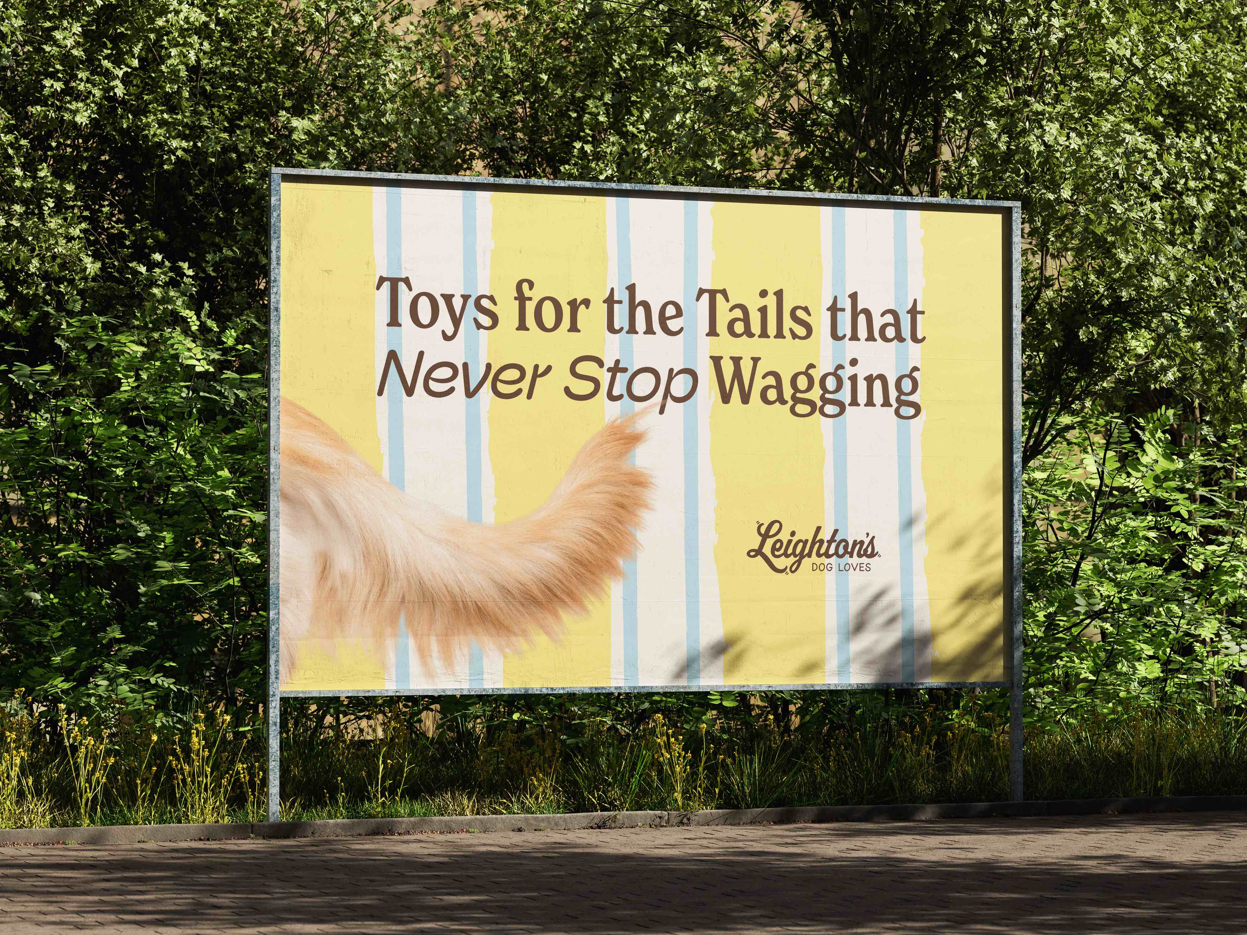
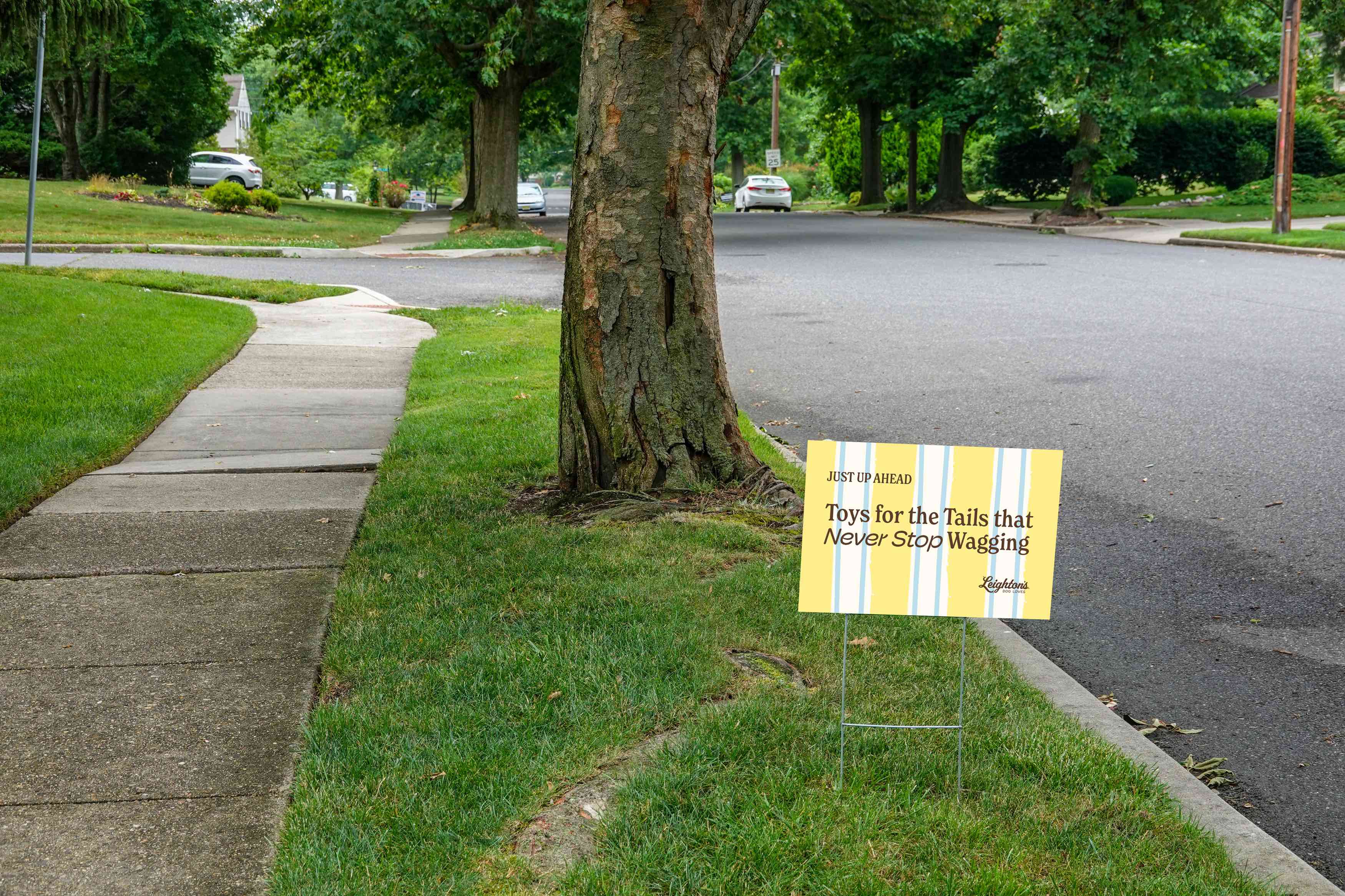
The inspiration for this brand came from easy, summer days spent playing the yard with your best friend and running up to the neighborhood lemonade stand. The colors yellow and blue were selected specifically because they are the only two colors that dogs can see.
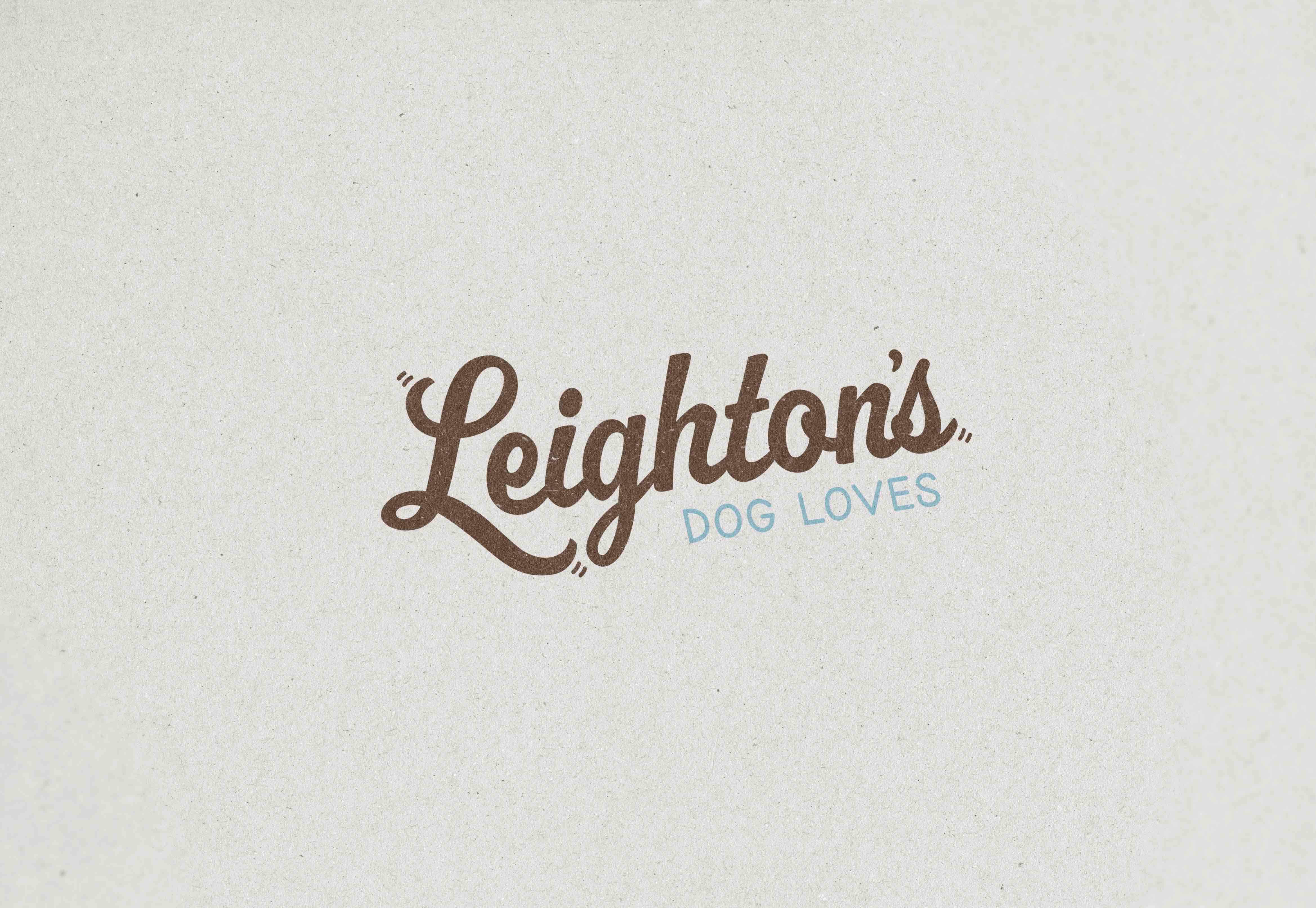
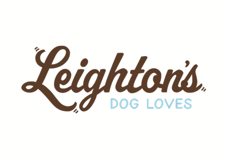
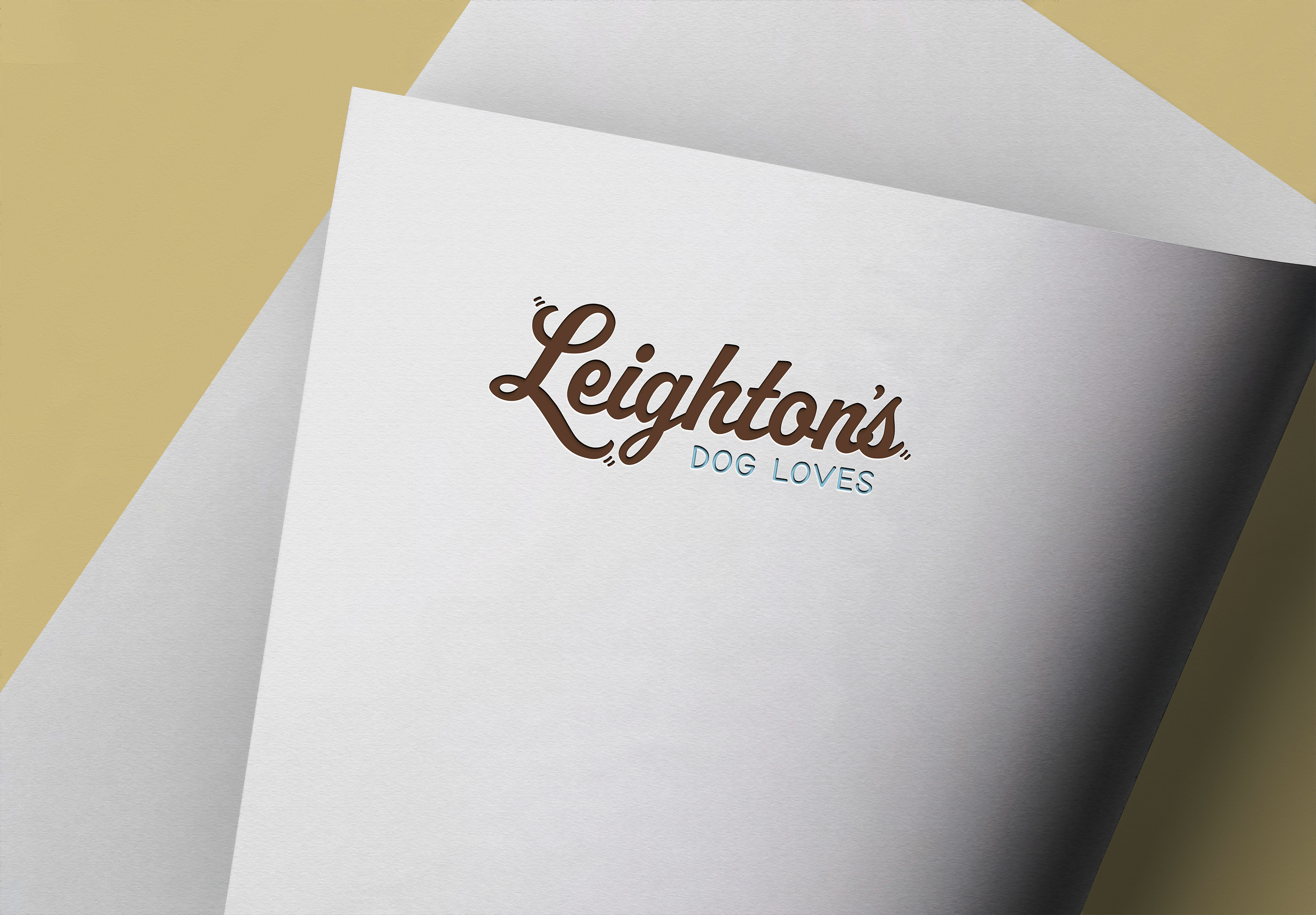
Alexis and Leighton knew they would need a word mark logo that could be scaled easily. So, we went with a custom script font and added in "accents" on the ends of the letters to symbolize the happiness Leighton's toys bring to each dog, aka their tails start wagging.

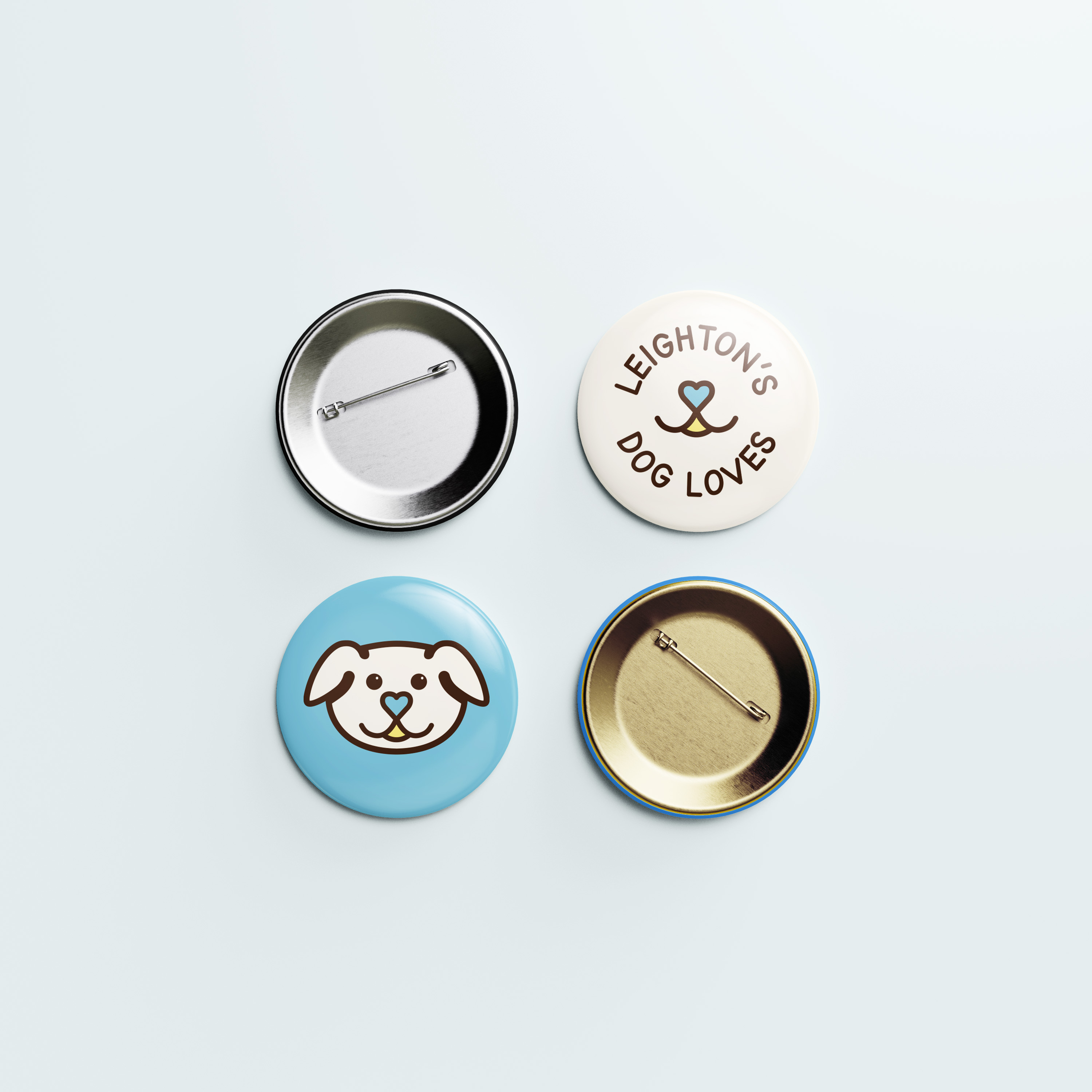


The brand symbol is of course the hand drawn dog come to life, but the abstract version is the smile that Leighton's dog toys bring to each dog.
The Brand Pattern is repeating yellow, blue, and white lines. This pattern is inspired by umbrellas and cabanas often found by the side of a pool. They aren't structured or straight up in down. Rather, they are a little rugged and not perfect to give more warmth and authenticity to the background.

Leighton now has all the essentials to sell her dog toys for pop-up events, including a table cloth, packaging for sales, contact cards, and merchandise.